What is kitsch? The word origins are German, but it is generally felt to describe art, objects or design that’s in bad taste because of excessive sentiment or garishness. Some Pop artists, like Jeff Koons, have deliberately played with the idea, such as his porcelain statue of Michael Jackson and his monkey Bubbles. If you take it to its extreme, somehow it becomes perceived as a valid art statement again. The question for the artist is, if you are not already recognized by the system, such as an art star like Koons, how do curators and collectors know when you are being ironic or are simply in bad taste? I personally think that much of Koons work crosses that rubric.
Artists cringe at the idea of being labelled kitsch, so it is no surprise that they often hurl such accusations at each other. I heard the term used on Portrait Artist of the Year, the judges concerned that a portrait may be too heroic or romantic taking away any real portrayal of the subject. Just a slight tilt in that direction can create kitsch. All of that is, of course, in the eye of the beholder when you are simply discussing the angle of the portrait and the light on the face. Not sure where bad taste comes in at that juncture?
I was shocked when I read a New Yorker feature on the 100th anniversary of the death of architect Antonio Gaudi that some considered the Sagrada Familia, his masterpiece, to be kitsch. I don’t know how that fits the definition unless you consider a tower for each of the apostles to be excess garishness. Clearly Gaudi had a unique vision for the Barcelona basilica that he has come to be most associated with. Towards the end of his life, Gaudi was said to have dressed like a pauper, practically living in his office on the site of the construction. His passion for the building continues to be evident, even though it has been challenging for subsequent architects to honour Gaudi’s intentions, especially when the anarchists during the Spanish Civil War trashed much of his original designs and destroyed the maquettes in his office. Gaudi was prone to continually changing his plans anyway, so who knows what would be correct in maintaining that vision? Started in 1882, it was originally expected to be completed in 2026, but that seems unlikely now given the work left to do, so many of its critics are taking aim at a work in progress. Could that level of dedication to a vision turn out to be kitsch?

Perhaps to be kitsch in the early 21st century is simply to create something that is popular. The Sagrada Familia takes in more money from tourism than it spends annually on its construction. Does that make it kitsch? I didn’t feel it was in bad taste when I visited it in 2016.
We see it in the music world all the time. When someone becomes successful they are seldom cool for much longer. If other people like them, it must be in bad taste.
I’m wrestling with this question on a painting I am close to completing. There is an open competition at a nearby gallery in December based on the theme “Life’s Moods.” Of course, that could mean just about anything, but I thought I would tackle it with something more personal after I finished my initial stab at it – producing a picture with long light of an individual strolling uphill to what would likely be a work shift. I liked the painting, (click here) but wondered if it fit the bill? Instead I chose to work from an old Halloween picture of our grandson running with his pillow case bag of candy from one door to another. I liked the exuberance, but did I cross over into excess sentimentality? Oh-oh! After my sister declared that a draft looked “cute,” I went into panic mode. The painting has a lot of challenges to it, including capturing the way the porch light colours the scene. I liked the composition — from a photograph that I cropped from one that was posted by a family member. I have to finish it by the end of the month — I will post when I feel it is complete, although I may decide to submit the original painting instead.
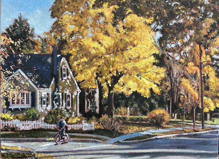
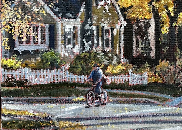
I usually try and steer away from the cliche, if not the kitsch. I don’t often tackle subjects that are really overdone unless I can bring a new perspective to it (see my Peggy’s Cove painting here). My dental hygienist was talking today about how I must be looking forward to the fall colour given I was a landscape painter. Fall colour is a similar challenge. It’s a crowded field. Everybody has done it. It is likely the most represented season in Canadian painting. I even have an original painting from another artist in our hallway that is set in autumn. I don’t think that painting is kitsch. Nor do I think the one I finally produced early this year is either. I think I pushed the composition to the point where it does look fresh. I do have a personal connection to it — I live literally across the street from this scene. I think if you approach a piece of art honestly — without trying to fit some mold — chances are it will avoid all the inherent traps associated with the kitsch or cliche. But who’s to know? As we saw with the portrait competition, it doesn’t take much to go over the cliff.
—
Keep in the loop and subscribe! It’s free. Want to see some of my recent paintings? Click here.

Leave a comment