Recently I found a copy of Kate Bryan’s new book “How To Art” while in Waterstone’s in Glasgow. It turns out, the signed copy also had an extra chapter on Banksy that was exclusive to the UK chain store. What surprised me about the book is both how accessible it was and the wide audience it intended to address, including everything from how to introduce your children to art to how artists themselves can find inspiration, particularly when stuck.
For those who are unfamiliar with Bryan, she is one of the three judges on Sky Arts Artist of the Year series, including both Landscape Artist of the Year and Portrait Artist of the Year. In the show she is billed as an art historian, but in reality she has worked in both and private and public sphere within the art world. On the dust jacket its says that since 2016 she has been curator of SOHO House’s art collection, which has about 10,000 artworks, none of them mine.
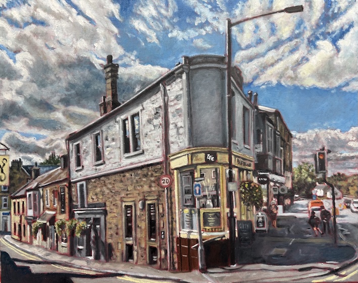
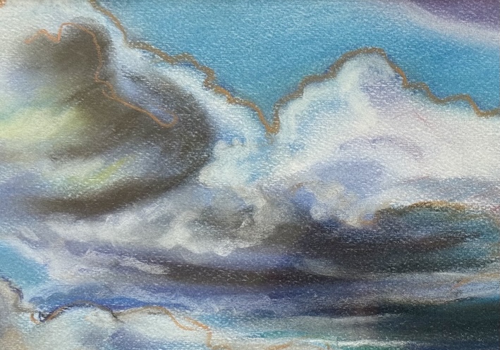
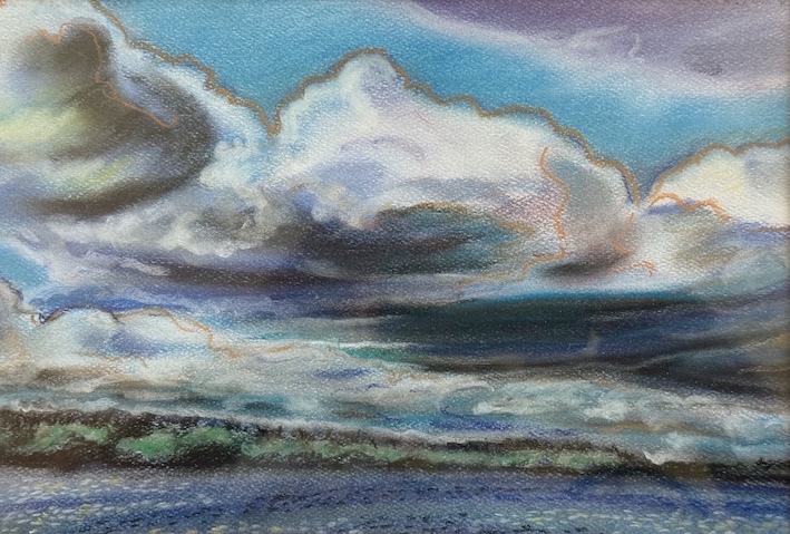
It so happened that one of my intentions of being in Scotland — aside from utilizing a flat my sister had generously offered to us for the duration — was to recharge my art activities. I find travel opens up news ways of seeing for me, especially when it involves visiting galleries and museums, or in at least one instance, a specific curated collection. More on that in coming posts.
While I’m not stuck, per se, I was very interested in Bryan’s views on inspiration. She notes that some artists may visit their favorite art gallery to recharge, but that it may compound one’s frustration in some cases. She notes UK artist Charming Baker, who she says once told her that “he feels physically sick if he sees a work by an Old Master while he is struggling with his own painting.”
I fit somewhere in between. I find visiting galleries wets my appetites to get back into my studio, but it is also intimidating and cuts to one’s confidence when faced with a masterpiece. Making art is a trick of confidence, for sure. When a work of art knocks me off my feet, my initial reaction is to try and figure out why. Then I cry that I’ll never be that good. Usually in that order.
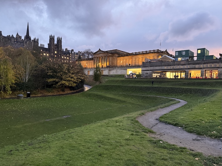
The National Gallery of Scotland is in fact dispersed throughout a number of locations. This seems to be a thing in Britain — big names like the Tate and the V&A have spread throughout the country. In Edinburgh alone, there is the main location close to Waverly Station, then there is the National Portrait Gallery up the hill, and if you head into Edinburgh’s new town, there are two modern galleries that also belong to the National.
On this trip we did make it back to the National Portrait Gallery (we had last been there in 2022), if only to look at the new work in the contemporary portrait galleries, including recent winners of the Portrait Artist of the Year competitions. I think the National has figured out that these portraits do draw in a certain audience. Then we walked down the hill to get to the main location, which houses an ample cross-section of Scottish art on the lower level, and a generous survey of international historical work on the upper floors, including such diverse icons as Tintoretto, Titian, Rembrandt, Rubens, Botticelli, Velazquez, Goya, and Van Dyck, to name a few. For a country of about six million people, it really has an impressive collection.
It was on the upper floors we turned a corner and were confronted with a painting I had long admired in books but never seen in person — John Singer Sargent’s 1892 portrait of Gertrude Vernon, Lady Agnew of Lochnaw. Her direct stare froze us in our tracks. Singer Sargent has this way of creating incredible presence in his work yet often maintains deceptively loose brush work. You feel confronted by the image first, the paint secondarily there to remind you of the magic that the artist has rendered.

This portrait for Singer Sargent was his comeback, the one that made him acceptable to society after the scandal his painting of Madame X created while exhibited at the Paris Salon. Wiki describes Madame X quite well: “Sargent shows a woman posing in a black satin dress with jewel straps, a dress that reveals and hides at the same time.” Critics found it to be vulgar and oversexual. Curiously, Madame X was not a commission, but rather a painting Singer Sargent chose to do.
While I had seen Gertrude Vernon’s portrait in reproduction many times before, it was a very different experience seeing it in person. While the trappings are very much of the time, it still feels very current, as if she sat there waiting for you to enter the gallery. In a room full of impressionist paintings, it was remarkable in-so-much as it overwhelmingly commanded attention over such crowd-pleasing competition from the normally more popular French Masters.
It also strikes me both how formal and how casual the piece is. The sitter looks relaxed, her legs crossed and her body reposed to one side of the chair, revealing the magnificently painted fabric. While Madame X was considered overtly sexual, this painting was described instead as beguiling.
It led to a flood of commissions for Singer Sargent, or what fellow artist Walter Sickert described as “Sargentology.”
Clearly Singer Sargent brought a lot of skill to this work, in both the composition, the tone, the colour and the paint handling. But I later wondered how much this was a collaborative work? Without such a sitter, considered a beauty in her time, would society have fallen over itself in the same way? How much of her pose was Sargent, and how much was her own? The pose can determine much about the personality of the sitter. And let’s not forget that direct hypnotic gaze.
The gallery’s catalogue notes that the cost of sustaining her “celebrity with style” led Vernon to sell the painting in 1925 to the National Gallery of Scotland, where it remains a hundred years later. It’s sad she couldn’t keep it.
The gallery has hung the portrait high, making it difficult to fully see given the lighting reflecting off the varnish. Visiting the other salons in the gallery, its obvious they have hung the works according to the period in which they emerged — often stacked up to the ceiling rather than the more modern approach of hanging everything at eye level.
—
I’m back from my travels, and it seems overwhelming the list of art activities on the agenda. My neighbour kindly took over a painting of mine to a nearby gallery for entry to a juried show in December. They’ll make a decision whether I’m in or out by November 17th. Meanwhile, while I was in Scotland I learned that I have been accepted as a guest artist in the Scugog Studio tour at the beginning of May. There is also a third opportunity in Toronto for another juried show in January based on the colour pink. The deadline is December 7th for entry. That’s not much time to pull a piece together, especially while recovering from jet lag.
I briefly went into my studio yesterday to drop off a new pallette — the last one looking like one of those grade school topographic maps with the protruding mountains. I was recently in a local gallery that was selling used paint-covered artist pallettes,. I now wonder if I should be just chucking these out or whether to wait and see if there is any interest? The gallery owner told me that people buy them and hang them on the wall next to their collection. Really? How odd.
Being in the studio I reminded myself of the work that I just got started on before heading to Scotland on October 2nd. That’s quite a gap. As those who know me already understand, I usually work on four and sometimes five paintings at a time, rotating them daily, sometimes having two canvases on the easel in the same day. With a short deadline for the pink painting, it may take priority, although I am eager to get stuck in.
More to say about my art experiences in Scotland in the coming posts.
Meanwhile, if you want to peruse my most recent work, click here.