I was rather shy as a kid. While I had friends, I was okay with my own company too, playing with my Corgis, gluing together model airplanes, flipping through a book or making a drawing. My mother said I was an easy kid. Most introverts likely would be. When I went to art school I observed many students just like me. While the pursuit of art making can be considered a solitary activity much of the time, I am okay with that. I go into a mental zone when I cross the threshold of my “art hut” studio, selecting some tunes for the stereo, adjusting the temperature, and going to whatever is scheduled for the easel that day. Keep in mind that for those who hope to go out into the world, half of your time is spent on the business side, from maintaining websites, responding to call for entries, refilling art supplies, picking up and delivering paintings to and from shows, tracking receipts, organizing your studio and participating with artist groups. I am presently also working on a book of my work, trying to translate what I see in my work into words. I’ve got quotes from several printers and hope to have the first copies available by the time of the Scugog Studio Tour.
It’s not to say artists don’t collaborate. In Canada we have the often told stories of the Group of Seven taking a train to the northland and painting together in the wilderness. And of course, everyone knows about the ill fated relationship between Vincent Van Gogh and Paul Gauguin. Some artists rely on a team of artists and technicians to do their work. When we were in Scotland we saw an exhibition of work by funny man Billy Connolly. The stainless steel sculptures and the large-scale prints were done from Billy’s drawings by other artists under his supervision — the same gallery also had work by Johnny Depp and Bob Dylan which I suspect would have also similarly relied upon others. I have participated in group events with my colleagues, including Paint The Town in Annapolis Royale. Once a year artists descend on the rural Nova Scotia town, paint en plein air, then have their often wet work collected by volunteers in pizza boxes who take it back to the Art Centre. At night a silent auction takes place in which the proceeds are split between the fundraiser for the centre and the artist. The biggest show I was involved with was Ecphore ’87 in Halifax. I was chair of the Ecphore Exhibition Society that year. We hosted about 200 artists in an old disused building in downtown Halifax. Over the course of the two weeks it was open we saw about 5,000 people come through, including about a thousand people at the opening and closing. It also generated a fair amount of media attention. What artists can do when they work together can be surprising.
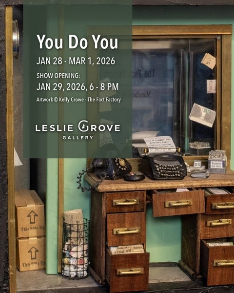
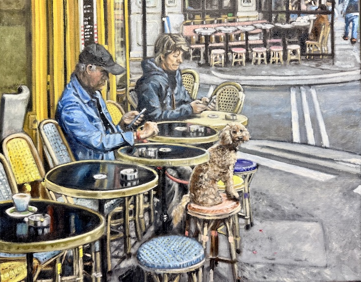
Many communities have art groups that meet regularly, stage workshops and often exhibit together. I belong to several of these, including the Artists Network in Toronto, of which I have a painting in a juried show opening this evening (January 29, 2026) at the Leslie Grove Gallery (which is run by the Network). Last week I joined an on-line workshop with them that sought to answer what juries are looking for in call for entries. In the end, I think the best advice is simply to read the posted instructions carefully. In December I attended another about how to photograph your art for submissions.
Last week I also travelled to Ashburn, a small community in North Whitby. It’s there that I will be sharing space with two other artists as part of the Scugog Studio Tour at the beginning of May. I met Pat Neal, a textile artist who stunned me with her light filled loft studio filled with looms. On the day she will have her students present to offer demonstrations. I was grateful for all her generous advice in preparation for the tour — while I have exhibited in numerous group exhibitions, I have never participated in an organized tour like this before. Her studio is in a converted barn — her looms situated on the second floor. What is normally storage on the lower level will be cleared out for myself and glass artist Marjolyn Pritchard, of which Pat made numerous helpful suggestions on how I might set up. She already thought through a bright alcove next to the window for Pritchard. Pat is hoping for less than grand weather on the day — she told me that their tour numbers are down on glorious May weekends when the sun is out and the flowers and plants are calling for their gardeners. Normally a weekend will see about 200 people come through. When I described my goals for this year, she had suggested going to the Scugog Memorial Library in nearby Port Perry. Just to the left of the front entrance of the library is the Kent Farndale art gallery, named after a library volunteer who was responsible for curating community art shows there. With more group shows behind me, I decided to send in an application to exhibit — three week shows now booking into 2027. The gallery on the day I visited featured work by Stephanie MacKendrick who shares my interest in travel. I bought a small 12″ x 12″ painting of the Thames River in London.
I also stopped in at Scugog Arts, where I had assisted on editing the “book” for the studio tour. Coming across my own description, I realized that I should have taken a second look before hitting send. The people in the gallery space were very welcoming — as are most gallerists I have met.
I have also begun to think about what to submit to the Oshawa Art Association annual juried show at the Robert McLaughlin Gallery in Oshawa. Their meetings are not far from where I live and are usually more oriented around making art than the business side of it. It’s fun to get out and see what others are doing, and talk to people who often share your language and love for art. The OAA meets monthly at the Artists Resource Centre next to City Hall.
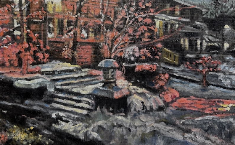
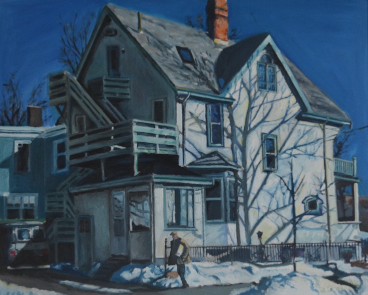
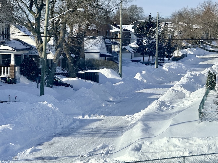
It’s been a hectic few weeks, much of it spent out of my studio space. At the top of this post I placed an image I took coming back on the GO Train from Toronto after dropping off my painting at the Leslie Grove Gallery on Monday. In the dead of winter, its about art promotion, art making, and clearing snow. Apologies to Murray McLauchlan for stealing today’s post header.
—
Want to just look at example of my work? Click here to see my on-line gallery.