Can you imagine a job posting that disqualifies applicants with any experience?
I recently came across a call from an art gallery looking to expand its roster of talent, limiting it to only artists who are either new grads or self-taught artists just beginning their art career.
I had heard of this before, but didn’t quite to expect to see it in writing.
A friend of mine had suggested that this was common — that galleries were simply not interested in older artists, preferring “young ones” they could sculpt in the way they wanted.

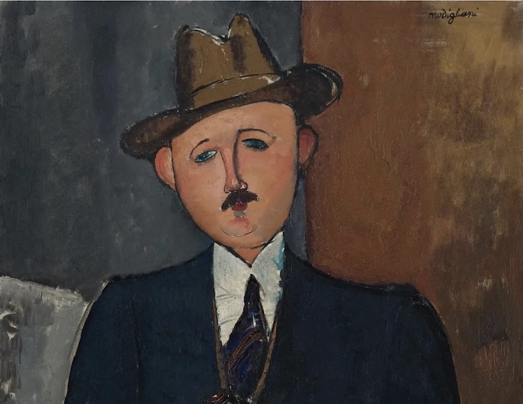
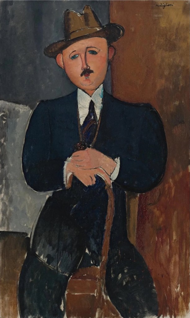
It strikes me that many well-loved figures throughout art history would have been excluded by these gallerists. Paul Gauguin was a successful stockbroker before he became an artist later in his career. Canadian abstractionist Jack Bush didn’t go back to OCA until he was well into his 30s, and worked days as a commercial artist for 41 years before retiring to pursue his art full-time. Paul Cezanne didn’t have his first solo exhibition until he was 56 years old. Celebrated photographer Vivian Maier wasn’t recognized by the art world until her negatives were found in a box after her death. Then there is the whole oeuvre of “Outsider Art,” made up of artists who never participated in the recognized art world. Henry Darger is likely the best known. He died in poverty, having worked most of his life as a janitor. His works are now selling for as much as $600,000 US.
I noticed that gallerists frequently look for consistency rather than creativity. David Hockney, one of the most celebrated artists on the planet, would certainly fail that measuring stick, his style frequently shifting as his career progressed. Known for his painting, he took four years off to pursue photographic collages. He made art works on a photocopier. He also spend years doing opera sets. He even ran a first edition print series in a newspaper. You could get an original Hockney art print for the price of a newspaper. To me, that’s about creativity, not consistency.
While Damien Hirst is best known for his assemblies around the topic of death, he has found new consistency in producing more than a thousand paintings of coloured dots. Some paintings the dots are very large. Others very small. If you have been to an art fair in recent years, you’ve likely seen one of these paintings. They are very boring, but consistent.
Welcome to the art world.
I graduated with my BFA from the Nova Scotia College of Art and Design (University) in 1987. It was clear from the moment I graduated that I would need a job to sustain myself. That was not exactly a revelation given I worked considerable hours for a design and advertising company to get through school in the first place. One thing the school didn’t prepare us for was survival as artists. I spent time as a graphic designer for a public library, then became their head of communications for a short time. I did freelance work for a number of clients, including a theatre company, a university and a union. I served as the editor of Visual Arts News (Visual Arts Nova Scotia) and briefly as the editor of NSCAD’s alumni newsletter. I made a film that was accepted in the Atlantic Film Festival’s short program. I came to Toronto and worked in the union world, joining the campaigns unit of a large public sector union where my skills could be best utilized, then became a staff representative negotiating contracts and resolving grievances before retiring. During that entire time I continued to paint, but the output was less is some years than others. Some years it was nothing at all, depending on how much my day job demanded of my energies. I retired during COVID, which was an intensely stressful experience as a union representative. After floundering around a bit post-retirement, I came back to my art, realizing that after all these years I now have the means to do so (thanks to my private pension plan).
Does that make me a mid-career artist? Or does that make me an emerging artist? Those labels can be important when defining opportunities and also when placing a price on my work. The fact that I don’t have any gallery representation is likely indicative of the latter. But can one have painted on and off for 40 years and still be considered emerging? Given my art is quickly shifting as I work close to full time (half of that time on administrative and developmental work), it is hard to say where it will lead. I don’t have anyone standing over my shoulder saying this will sell and that won’t. I do what I want, which to me seems to always work best. There’s something to be said for authenticity.
I belong to four art associations. The members I meet are often my age. I don’t know where the new grads are. Many of these artists have chosen to sell direct through their websites, frustrated with the gallery system. Some sell at artist-run events, such as the Toronto Outdoor Art Show, Riverdale Art Walk or Camp Samac here in Oshawa. I think there should be a drinking game involving artists who get together and talk about alternates to galleries. While my own site is not set up commercially, I do post prices on my gallery page and can certainly make arrangements should someone be interested in buying a piece. But there has to be a better way. I would prefer that people see my work in person before committing to buying a work of art.
So that’s my rant of the day.

—
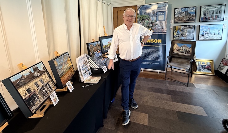
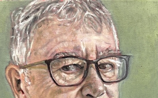
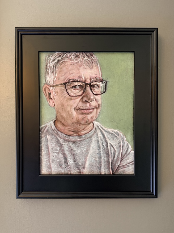
Meanwhile, I am back in my studio after the Scugog Studio tour at the beginning of the month. I am also back to looking at Call for Entries. Given everything I had on the go was shown at Scugog, I am now in a new rotation of paintings, so it may be a while before you see a new one posted here. . I typically work on four to five paintings at the same time, to allow myself time to refresh between layers, and also to allow the oils to dry. I am still thinking a lot about portraiture, although was recently reminded that I need to get my subjects to sign release forms should the painting actually look like them. Some exhibitors will not carry portraits otherwise. Can you imagine Vincent Van Gogh asking the Roulin family to sign release forms? We do live in interesting times. Is it any wonder artists resort to doing a lot of self-portraiture? I have had some interest in my call for portrait sitters, so we’ll see where that leads. Ideally, if it goes well, I would like to submit an entry into the Kingston Prize in September. The Kingston Prize was Canada’s bi-annual portrait competition, but it has just gone annual. The top 30 finalists do make the show, so it is worth the effort if not for the money, then for the exposure.
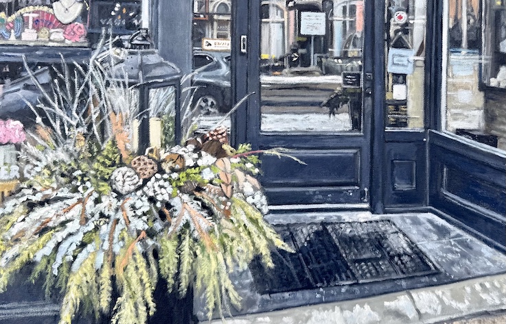
It is encouraging that my recent paintings are getting more of a response and showing up as sales. Unusually for me, I have sold three paintings in a little over a month. One of the new paintings I have on the go has led to a number of double-takes despite it being early days. And of course, my book is available should anyone be interested in obtaining one. Click here for more details.
I’m also spending a lot of time reading about art, currently on the 2021 Taschen book about David Hockney (hence why I know about his photocopier art). A lot of things are bubbling in my head.
If you haven’t done so already, please subscribe and you’ll be notified when I post something new. Given the way my newer work is selling, that may be useful (or not). Needless to say, you can subscribe for free.
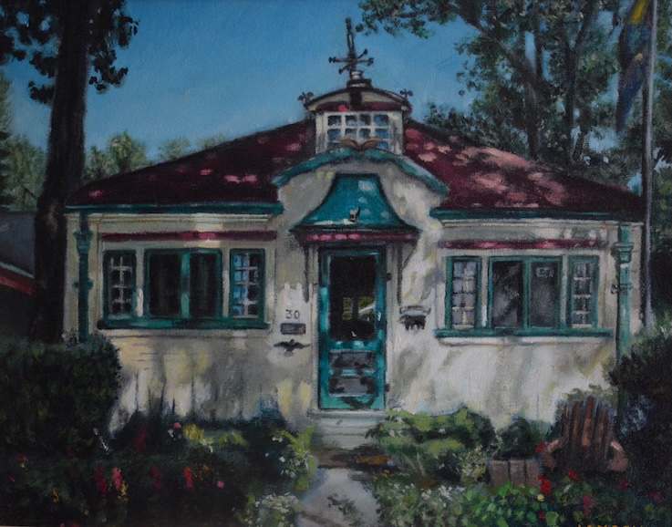
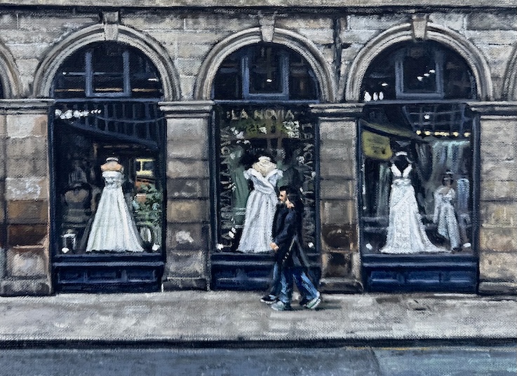
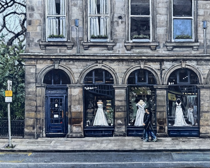
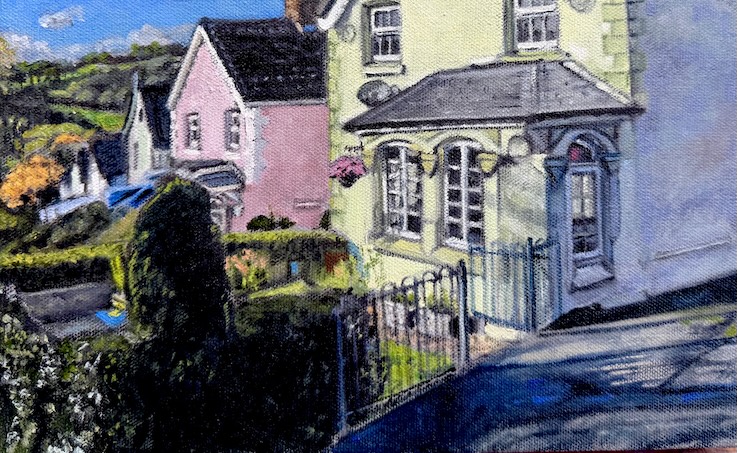
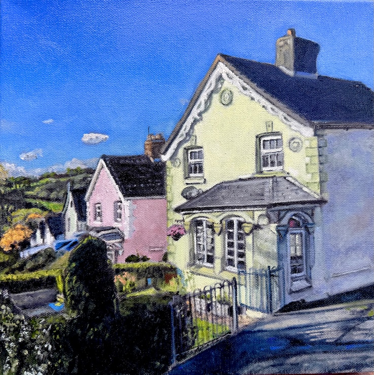
Today’s Painting: It’s an old one from 2007 of a cottage on the Toronto Islands.