Rick Janson Art Studio

My Art Journal

  • When Painting Was Dead

    The art world was in one of its “painting is dead” moments in 1987. It had been three years since New York’s Museum of Modern Art (MOMA) had last held an exhibition of contemporary painting. One of the pre-eminent gatekeepers of modern art, it would not stage another for 25 years. That alone speaks volumes of the world I stepped into.

    You might say it was an act of perversity to become a painter at that point in time, graduating with my BFA – which we cheeky students euphemistically called a Bachelor of “F-All” – from the Nova Scotia College of Art and Design. The school has since added the word “University” to the title, just in case there was any doubt. It started granting degrees in 1969 – the first art school in Canada to do so.

    Curiously, one of MOMA’s darlings of the painting world was my professor and studio advisor, British post-war artist Riduan Tomkins (1941-2009). His time at the Nova Scotia College of Art and Design was short (1983-86), likely his decision to move on spurred by a period of labour strife at the College. He is instead credited for influencing a generation of New Zealand painters after he left Nova Scotia. Those three years seldom get mentioned among his biographical details, although he remains vividly in my memory.

    Tomkins frequently reminded us that we stood on the shoulders of those that went before us. Just as I studied under Tomkins (among others), he drew a direct pedagogical line from our class to British painter Walter Sickert, who in turn was a student of Edgar Degas. Tomkins would frequently recite who was a student of who until we arrived back at Degas’ Atelier.

    One December, Tomkins was travelling over the Christmas break. With the College shutting down for a week, he asked if I would facilitate the pick-up of several of his paintings by his gallery in Toronto. I brought them back to the student apartment I shared and awaited the pick-up a few days later. It was stunning to see his paintings there in our modest living room. At the time his work featured a figure in the center of the composition, and layers of flat paint built up around it, the colours of the successive layers visible around the edges of the figure. It struck me that painting could offer a unique visual experience as the built-up layers of colour could not be easily replicated in any other medium, nor the sense of depth at the center of the canvas. To see his work on-line is a let-down after one has experienced it in the flesh.

    His advice at the time seemed clear enough to me: just add more paint. Painting is about, well, paint.

    It surprises me to see the return of figurative painting into the high end commercial galleries. Evidently the rumours of the demise of such painting were much exaggerated.

    Similarly, it was interesting to see in yesterday’s Toronto Star a story about movie fans lining up to get into the Criterion Closet, a van that stocked, well, movies on DVD/Bluray. Albeit they were 40 per cent off, a rarity for Criterion, but the fact that people were lined up to purchase what many believe to be a dead medium was phenomenal. Criterion had to set limits — you had three minutes and could only buy three movies, so you had to know what you were looking for before getting your chance. I’ve been a big fan of Criterion films (even though they are American). They are wonderfully mastered, offer a selection of rare, international and art films, and load up their discs with incredible features. We just recently finished watching a box set put out by Criterion celebrating the collaboration between Noel Coward and David Lean. The films look incredible. The insight in the extras was terrific. But again, we are talking about hard copies of feature films — something that was supposed to be over. Even on Duolingo, I noticed that one of the dialogue pieces in French spoke about a school that still used DVD as being so last century. Is DVD/Bluray about to have a resurgence like vinyl? “I love owning movies,” one fan told the Star.

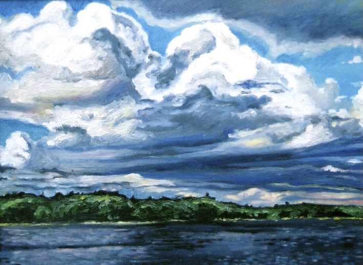
    Long Lake (1999) Oil on Canvas

    Today’s Image: My last post featured a pastel drawing — a rarity for me. However, I did follow through with an oil painting of the same image — a view across the water at Long Lake Provincial Park near Halifax. You can see how I was still searching for a more vibrant way to make my brushstrokes at that time (1999). I don’t often draw and paint the same subject matter, although I have been known to return to a subject I previously photographed to get a better idea of what was going on in the shadows. It’s one of the reasons I don’t often work from other people’s photographs — a photo may be the equivalent of a thousand words, but sometimes you need a bit more.

    Don’t forget to subscribe. It’s free! To see some of my more current work, click here.

  • Happy Accidents

    Imagine creating a piece of art that resulted from an interpretation of a coffee stain? The trick may be to use good quality coffee.

    Last night I attended a meeting of the Oshawa Art Association in which artist and animator Lisa Whittick (click here) spoke about her methodology behind these coffee drawings? paintings?

    At first I wondered if she had a caffeine issue to have so much coffee dripped on watercolour paper, but as she demonstrated, she actually takes a brush and smears the coffee on, including some splashes from a paint brush dipped in a cup of coffee. I hope she remembers to stop drinking from it at that point.

    After the coffee splashes have been given an opportunity to dry — sometimes she splashes it more than once depending on the outcome — she looks for potential images in the splashes, much like one might interpret a rorchach test.

    It did occur to me that given her coffee stains were not entirely accidental, that one could do this with just about any medium, including paint. But coffee is her medium of choice — Whittick explaining that she liked the colour.

    After she works out her scheme, she downloads some drawing aids to help her visualize the picture. In this case, she had seen a porcupine and some zinnias as inspiration from the coffee splotches, and subsequently came to the presentation prepared with some computer print-outs of both.

    From there she started working into the coffee stains with a black pen, varying the size of the nib depending on the need. That included, in some cases, simply drawing a line around some of the splash marks.

    From there the process is back and forth, as she moves between a set of pens, some conte, and an acrylic wash. Worried that the conte would overpower the coffee stains, she applied it gently using a Q-Tip. After about a forty minute presentation, she had a finished drawing — well sort of. Like many artists that I have referenced in the past, deciding when it is done is always the biggest challenge, and Lisa would start to answer some questions, then realized she needed a bit more white paint, or some darkening with a thicker pen, or a little bit more of something else. We’ve all been there.

    What’s interesting is that the process is a random way to start a piece, letting the coffee stains dictate what the subject matter is, although it is clear from looking at her work that there is a fantasy genre she largely likes to work within, so while it is random, clearly her own interests are not entirely lost. She explained at the start that it got over her fear of a blank page.

    I asked if her if she ever placed a coffee cup on the page, to have the addition of coffee rings to work from. She was amused by the idea, but had never done it.

    It reminded me of my art school days when I would drink so much coffee on my studio days that I was literally shaking towards the end of the afternoon, which in itself created a certain amount of dripping. The school custodians must have hated me.

    Whittick does these drawings as a means of keeping her creativity alive and sees it as a means of relaxing after her much more demanding career in animation, where as she says, it is a team effort that precludes individual expression.

    If you want to give it a try, Lisa is delivering a workshop on September 28. Click here for more details.

    Happy accidents are not entirely new. One of best practitioners of happy accidents I have seen is Christian Hook, who won UK 2004 Portrait Artist of the Year title. The winner of that competiton won a commission to paint actor Alan Cumming for the National Portrait Gallery in Scotland.

    Hook engages in a process that involves doing and undoing, creating what appears to be a straight-forward portrait or landscape, then messes it up and works from there, taking the random scratches or slashes as new information to work with. The end result leaves a piece that is figurative but also has abstract elements about it. It’s brilliant.

    It’s a little different from Whittick is doing given the randomness can take place in the midst of the process, not just at the start.

    In the documentary (on Amazon Prime) Hook engages Cumming in the process, including giving him the materials to make his own marks.

    When we visited Edinburgh in 2022, the Portrait Gallery was a key destination for us to see the Cumming portrait. It is stunning to see in person. Photographs of it just don’t do it justice, but you can none-the-less get a peek at it on Alan Cumming’s website.

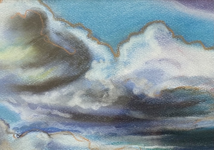
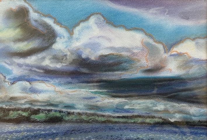
    Storm Clouds, Long Lake (1999) 8″ x 12″ Pastel on Paper

    Today’s Artwork: I looked through my files to see if there was anything that I could describe as a happy accident. Have to say that happy accidents scare the heck out of me. I’m far too much of a control freak to randomly undo my work in progress and create something new from it. Instead I offer up something else that scared me too — one of the few pastels I have ever done, this one looking across Long Lake, a Provincial Park on the outskirts of Halifax. You can tell why I’m an oil painter from this. I did use the drawing as the basis for a painting later that year. I’ll show it on the next post so you can see the difference. Always a trick to may you come back again!

    Don’t miss another post! Subscribe for free. Want to look at more of my stuff? Everything from late 2024 to the present is on my gallery, just click here. Meanwhile, consider joining your local art association. You’ll not only meet new like-minded creators, but get some good ideas too.

  • Colour the art world blue

    There appears to be a lot of hand wringing in the global art market after the first half numbers came in for 2025. Almost daily Artnet is reporting on another major private gallery closing its doors, and in turn, making it that much harder for emerging artists. These are the galleries that have made art careers. Now they are gone, some amid bankruptcy.

    The numbers that come up over and over again are an 8.8 per cent drop in fine art sales at auction in the first half of this year, the price of the average lot falling by 6.5 per cent. However, that doesn’t tell the whole story. Sales in the $1 million to $10 million price range actually rose 13.8 percent, sales of Old Masters rising by 24.4 per cent. Artnet notes it is the ultra-contemporary market that has cratered by a staggering 31.3 per cent. Wow.

    There are signs everywhere suggesting the global economy is about to take a swan dive, so it shouldn’t entirely surprise us that collectors are also stepping back, taking a wait and see attitude towards what comes next in a world turned upside down by events in the US, the Ukraine and the Middle East.

    The art market had been roaring for the last six years. It seems the party has come to an abrupt end.

    Some are suggesting there are bigger and more deep seated problems, including the lack of a next generation of collectors. Is overall interest in the visual arts in deep decline?

    One analyst suggested there was also an investor class that came into the art world seeking only to make a quick buck, which was possible for a while. The speculation is that they have rushed back to Bitcoin. I get the impression that some regard that as a “good riddance” moment.

    It reminds me of the scene in Woody Allen’s Hannah and Her Sisters when Dusty the nouveau riche rock star (played by Daniel Stern) comes to see Frederick, a temperamental artist (played by Max Von Sydow). The artist tells him that “you don’t buy paintings to blend in with the sofa.” The rock star replies sincerely, “it’s not a sofa — it’s an ottoman.”

    Galleries that do millions of dollars in annual art sales are posting meagre profits amid rising costs. A recent story suggested that a gallery needed to make about a quarter million dollars in sales to simply break even at each of the fall art fairs, the cost of the booth running around $100,000 for the term of the fair. Add to that travel, hotels, framing and all the extras associated with hosting a booth. How sustainable is this?

    In Artnet’s intelligence report, it gives the example of Sadie Coles HQ, a London gallery that represents 60 artists. It saw sales of $38.6 million in 2024 (down from $79.6 million in 2023). Profit in 2024 was $279,000, or a 0.7 per cent margin.

    It will be interesting to see what happens this fall — will art sales bounce back, or are we into a new phase in the art world? Is this just a cycle, or as many have said, is it something else?

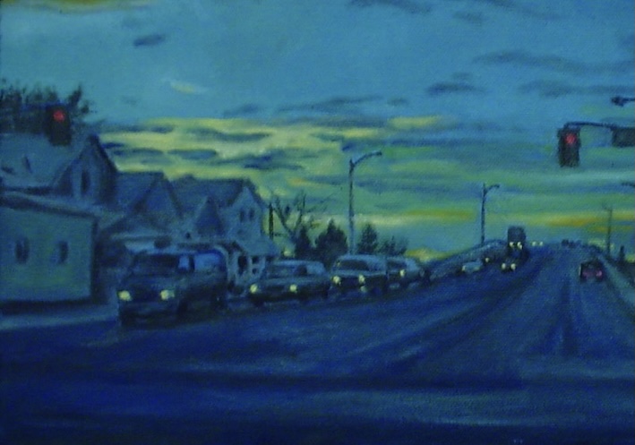
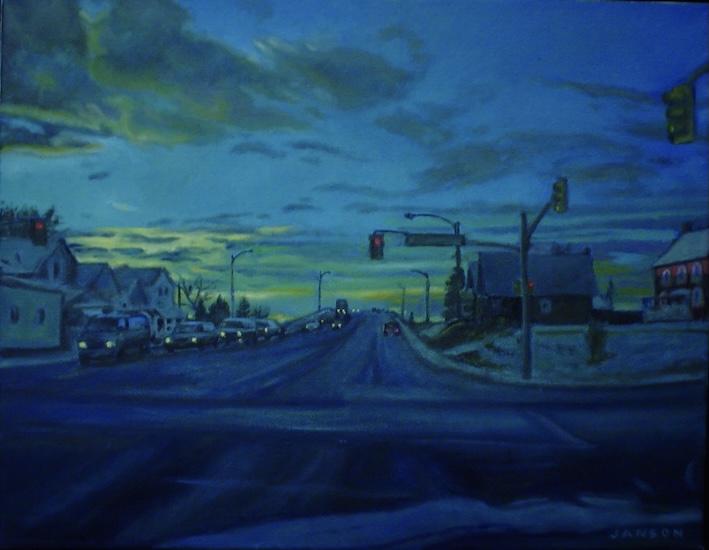
    Blue (2005) Oil on Canvas (Private Collection).

    Today’s painting: Given how blue the outlook is in the art world at present, I thought it would be appropriate to post my painting exhibited in the “blue” show at the Eastern Front Gallery in 2005. That was my view for at least five years as I commuted down Ritson Road in Oshawa towards the westbound 401 and my job in North York. The gallery received many submissions for that show and I was happy to be selected to included by the jury.

  • But will it last?

    One of the first things I was taught as an oil painter is that you never place thin over the thick. In other words, if you are using turps to thin your paints, don’t put them atop a layer of paint that was used directly out the tube.

    The reason is simple: the net result is the paint will crack.

    So when I see oil painters dripping diluted paint at the end of a process, I wonder what the conservation issues will be around this work. It has become so overused it likely doesn’t matter.

    It is an interesting question given how much critics love to see evidence of process in the work. But what they love may be undermining the painting itself, assuming the artist didn’t have the foresight to use even thinner underlayers or work in another medium altogether.

    We likely have artists doing this thanks to Jackson Pollock and his famous drip paintings from the mid-1940s. They revolutionized the art world, but themselves are frequently the discussion of conservation issues. Not all of it is related to the paint Pollock used.

    Pollock famously used ordinary housepaint, most of it on unstretched canvas unrolled on the floor of Pollock’s barn. However, as numerous scientific analyses have shown, he often also tubed oil paint under it. Sometimes one colour would go on over another, creating intersectional points where the paints blended. Other times, he would wait for a layer to dry before applying the next. In his 1947 painting Alchemy, he also added other materials, including sand, pebbles and twine. In the 2018 restoration of Number 1 (1949) conservators found cigarette butts in the work as well as a honey bee they calculate flew in there by accident.

    Louis Menand in his fantastic book The Free World: Art and Thought In The Cold War, speaks about the reluctance of the Boston Museum of Fine Arts in 1976 to purchase Pollock’s famous Lavender Mist (1950) because it had already badly deteriorated. That didn’t stop its owner Alfonso Ossorio from selling it to the National Gallery in Washington for $2 million in the same year. Ossorio had paid $1500 for it in 1950 at the disastrous Pollock show at Betty Parsons Gallery. The poor sales at that show likely ended his interest in making drip paintings. Pollock turned his attention to figurative painting after that, and by 1954 he stopped painting altogether.

    Conservation issues repeatedly show up for Pollock’s work, and I can only speculate that the cost of conservation may have been a consideration for the Museum of Modern Art to de-accession Pollock’s Number 12 (1949) in 2004.

    In the past museums varnished Pollock’s work to try and preserve it, only decades later leading to more restoration to remove the varnish after it dulled the colours and yellowed.

    In the famous mural Pollock did for Peggy Guggenheim, the canvas supports started to sag, leading the paint to chip off as the canvas buckled (this is a more common problem that you would think — works by other major abstract expressionists have undergone this problem too). It required the entire painting to be placed on new stretchers.

    One of the issues that conservators also face is what happens with the aging of areas of unpainted canvas. If it hasn’t been primed, the canvas will brown. I was aware of this myself on the only work I did on unprimed linen. I thought it would be interesting to see how the painting changed over time. The owner of the painting still appreciates it.

    British artist Damien Hirst says that it was his intent to have his shark deteriorate as part of the process in his landmark The Physical Impossibility of Death in the Mind of Someone Living (1991). You may recall that Hirst first came to everyone’s attention by building large tanks filled with a formaldehyde solution and placing various creatures in them, the first a tiger shark. It was said by the time Hirst replaced the shark, that one could barely see it in the cloudy formaldehyde solution.

    And that, of course, raises the question of value, given the piece is no longer 100 per cent original. I’ve seen an extensive rationale on why it should retain its values, including the originality of the tank and frame. Hmmm.

    Hirst’s company says that it will replace any of the animals that are older than 10 years.

    Artists working with non-conventional or poor materials are always going to be a concern. Galleries now caution painters, for example, not to use cheap canvas. If you are going to Michael’s and getting a value five pack, that’s cheap canvas. The difference is usually the supports the canvas sits on.

    Among Canadian artists, Emily Carr is well known for the conservation issues that arise with her work, painting many of her pieces remotely using gasoline instead of turps (apparently doable, although very dangerous). She also worked on inexpensive papers that have deteriorated, or had them mounted on acidic backing boards that leached into the painting. Collectors still seek out her work despite this, and more recent criticisms that she appropriated the work of indigenous artists. I won’t offer an opinion on the latter.

    Visiting the Vancouver Art Gallery some years ago, I noticed an Emily Carr exhibition had to be shown under dimmed light for preservation reasons.

    The lesson for artists: know your materials. Don’t save $10 on a canvas to totally make all your work on that canvas valueless.

    Untitled (2019) Oil on Canvas (Private Collection)

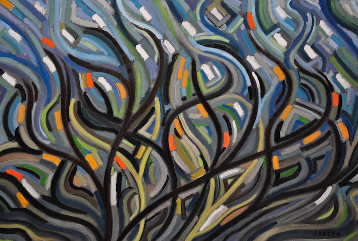
    Today’s painting: Another of my abstracts from 2019. It sold almost immediately, I hope it has survived the rigours of time well.

    Subscribe and never miss another post! It’s free. If you want to look at some of my more recent work, click here.

  • A Change in Meaning

    When you paint something, the image sticks with you. How do you look at and consider a subject for ten or fifteen hours or more and then forget it? You remember the details, what gave you difficulty, where the magic happened in the process. It’s hard to explain, but after a painting is complete, there is almost always a feeling as if you have a deeper relationship with that particular subject, or in this case, a location. Your fingers have traced out the curves, the shapes, your eye has deciphered the colour. You’ve fit what’s before you into a meaningful composition. You’ve found a way to capture the light.

    When I was a student I used to cycle to Peggy’s Cove, Nova Scotia and regularly sketch the cove and the lighthouse. It helped me get through a difficult time financially. One day I challenged myself to draw the lighthouse and all the surrounding rocks entirely from memory. I was able to do it. The next day when I was there for real, a tourist purchased that drawing made from memory. When I go back to Peggy’s Cove, now decades later, I still feel deeply about that place. It’s hard to explain.

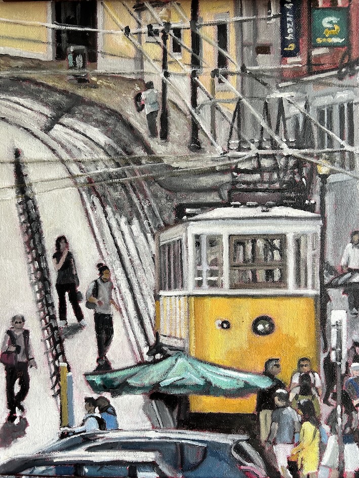
    In the last few days I’ve returned to today’s image a lot since I heard the news of the tragic funicular crash in Lisbon. When the first images appeared on the news sites, I immediately recognized the location. I had painted the Gloria funicular less than a year ago after a return from Portugal. A friend had stayed in a hotel beside it. He had asked me for a piece that depicted either the funiculars or the yellow trolleys which are symbols for the city. I have a T-Shirt with a trolley on it.

    In Lisbon I had taken many pictures as reference. My spouse heard me curse many times when a car popped in front of a picture as I was about to time a key moment. Or a tourist would walk in front of the camera. Or suddenly a cloud changed the light. In the end, I did capture a number of successful images, and am still thinking about going back to the subject. Curiously, we never travelled on either largely because of the lines to board. In addition to the funiculars, you can get to the top of the hill by taking an elevator. Or, as we did, you can walk it.

    For those who have been avoiding the news, on Wednesday (September 3rd) a cable had likely snapped sending a popular 140-year-old Lisbon funicular hurtling down a steep hill, derailing on a curve and crashing into a building. Sixteen people died in the mishap, and about twenty were injured. Five of those killed were Portuguese, including the driver. The rest of the travellers were from Canada, South Korea, Ukraine, Switzerland, France and the United States. The funicular can normally carry about 40 passengers, although there has been no confirmation as to how many people were aboard at the time of the crash.

    Lisbon Funicular (2024) 11″ x 14″ Oil on Canvas (Private Collection)

    Where the crash happened is a crowded spot, especially around rush hour. The crash happened around 6 pm. The area where the funicular finishes its downhill journey is a popular destination for diners. We ate in that square many times.

    That day I had difficulty getting my reference photos, hundreds of people crossing back and forth near the funicular. Even in the final work that I completed, you can still see many people walking both in front of the vehicle and beside it.

    When I completed the painting I thought it a sunny memory of our time in the city. It was very Lisbon. Now it has taken on a new meaning knowing what has happened right there, in that very location.

    Like this BLOG? Why not subscribe? It’s free and you’ll get notice whenever a new post goes up.

  • Tweaks and wrinkles

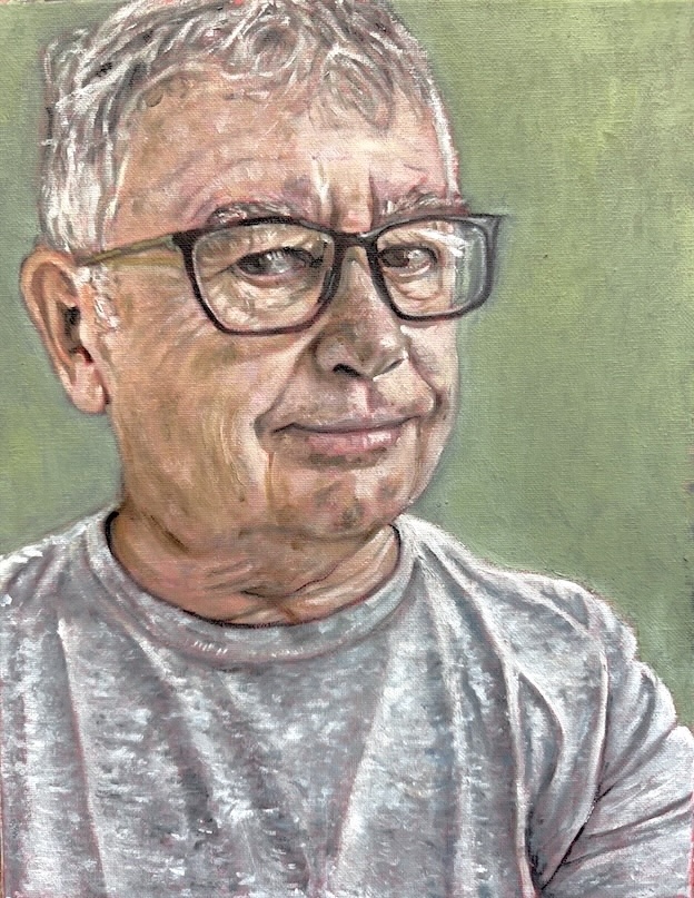
    Here we go again. As part of my path towards a formal self-portrait, here is my second study. I’m still debating whether or not it is done. Depending on the light in which I view it, it either looks exactly like me, or like me in about another twenty years.

    In this study I wanted a close look at all the details on my face, including my happy crow’s feet and some of my age spots. However, as much as I have tried to apply a light touch to these, they tend to look — at least in photos of the canvas — like they are way too pronounced. That’s why I may go back.

    However, as a painter, I love working through all those wrinkles and bulges and other signs of life my face exhibits to the world. As a painting, I rather like it, as it seems do others. I just wish it was making someone else look old!

    Among the comments thus far: it really looks like you, but it’s not exactly flattering. That I can handle. When i’m in the midst of a work jag in the studio, I don’t always look my best. It’s amazing I don’t have any paint on my face. I’m happy to look like an old dog.

    The next study I will go a bit bigger and incorporate more of my body. Perhaps I will be a little kinder on the third try. Or maybe I will find other elements to exaggerate and play with. Stay tuned!

    Self Portrait Study 2 (2025) 11″ x 14″ Oil on Canvas

    Meanwhile, this morning I had the chutzpah to apply for a solo exhibition in a local gallery. The gallery is booking a year to 18 months in advance, which suits me, although it means that a lot of my work will be tied up at least until then (assuming my proposal is accepted). Luckily I’m in no hurry to sell anything right now, although it means I’m also absorbing a lot of related costs, including framing, artist association memberships, gallery memberships, entry fees, on-line costs, studio maintenance not to mention the cost of paint and canvas. Thus the life of an artist. Thank heavens for my work pension. Behind every great artist is usually another source of income.

    It is interesting to view the application process galleries are requiring on-line. Galleries often want sample files sent in a certain way — in this morning’s case, the file had to be named with the title of the art then the artists first and last name. The file was also limited in how big it could be, although it was a bit confusing given they posted the maximum file size as 256 MB when they likely mean 250 KB. They also talk about the need for larger files for printing purposes. Then when you resize the images and upload them, they often appear larger than the size you initially set them too. Sigh. While it was supposed to accept a JPEG format, it repeatedly rejected one image which required me to send it again as a HEIC, which is usually more efficient anyway and offers better quality. Note to self– no more JPEGs.

    It was the first time I had come across a requirement to make the artist’s statement in “first person.” I’m so used to putting out material in the third person it took me by surprise. I was half way through writing it when I noticed the requirement. Galleries seldom give you a lot of space for your blah blah blah. I am beavering away on a book that I had initially thought of printing this summer, but I may postpone it until next year, hopefully closer to the date of a show. Given my proposal is for a show about all the issues around travel, I also want to do postcards of several of the works.

    As difficult as it is to often follow all the detailed instructions galleries post, participants were warned on a recent webinar hosted by the Artists Network (Toronto) to pay attention to those details. If you paid $45 to enter a painting into a competition, the last thing you want is to be disqualified over a small technical issue. The presenter noted that it is easy for juries to simply take you out of consideration if you haven’t labelled your digital files correctly.

    If my bid for a show is accepted, then there will be additional fees and requirements, including signing a contract and presenting them with an inventory of the artworks for the show in advance.

    If I am successful I will post the dates/location on the Recent Exhibitions page. I also have some other planned group shows I’ll be applying for in the upcoming season.

    Meanwhile, if you read yesterday’s post, you’ll notice that I discovered a small tweak was needed to the painting that I was using to show the process of how I make my work. The tweak is done, and the painting now in the gallery section (click here).

  • The process of painting

    The most common beginner mistake made by new oil painters is to think they can start at one side of the painting and simply work across and finish at the other.

    There are some materials where there is little choice but to do that — such as an artist doing a proper fresco and having to work into fresh plaster every day. You only have so much time. Michelangelo did his Sistine Chapel in small squares, adding a bit more each day as if they were all pieces of a puzzle.

    But for most of us, oil painting is a process of building layers until you achieve what you set out to do. The risk is always of overworking a canvas, but for most, the danger of underworking is usually much greater.

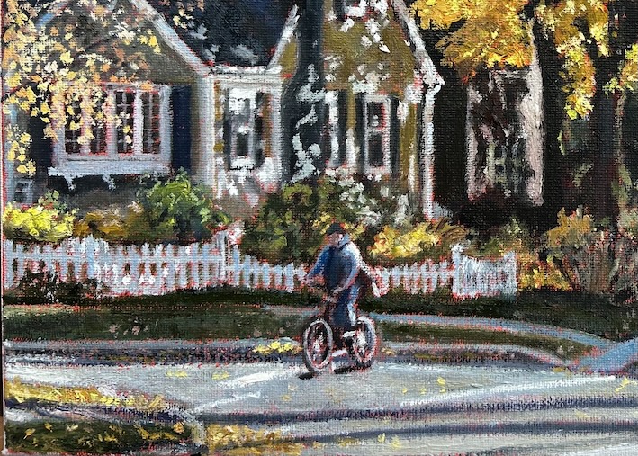
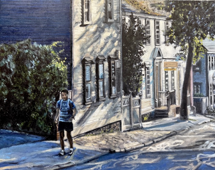
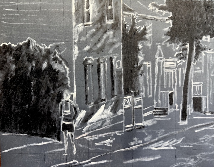
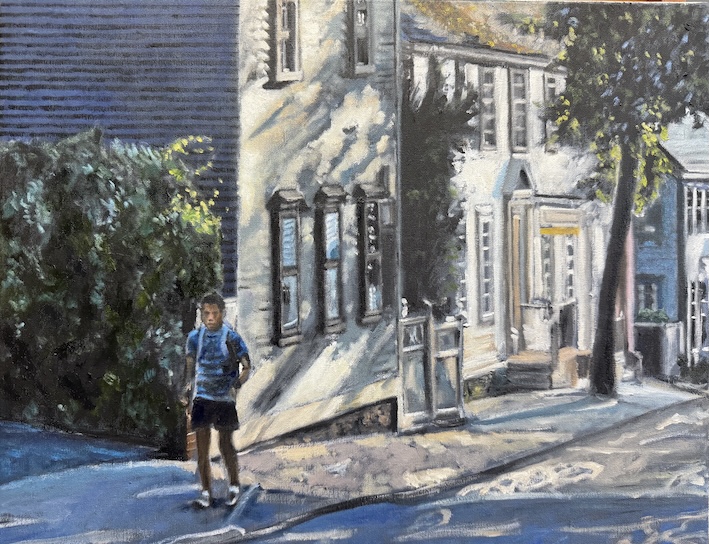
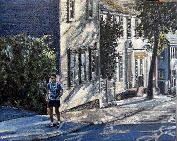
    I decided to document the various sessions I had with this new painting, each session representing two to three hours. Many artists use different and valid processes, but this is the one I commonly use.

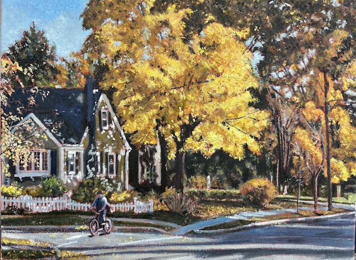
    The painting is from an image I took in Newport, Rhode Island, while attending one of the jazz festivals there. I liked the long light and the story it told of the person walking uphill towards, presumably, a job. There was a hotel at the top of the hill, and I suspect he was headed there. I liked the fact that the houses were all irregular shapes, no doubt partly from settling over time. It’s far from crisp vertical and horizontal lines.

    Working on a white canvas is very difficult, given it is hard to assess your colours as you initially put them down. As such, many artists put down a flat ground first. In this case, I simply painted the canvas gray. After that, I use the grid method to transpose my image on to the canvas, in this case going a little further in delineating some of the darker areas.

    For those who are not familiar with the grid method, it involves drawing a grid on the canvas in an equal number of squares to your original image. I use a gridding software, so I don’t have to physically made the lines on the original photograph or drawing, although prior to the software, that is literally what I used to do.

    Once the original has been gridded, it makes it much simpler to figure out where all the key lines in the piece fit, matching the squares one by one. The grid helps you avoid making major corrections only to discover a key part of your composition is now off the canvas altogether. You don’t want to fix the proportions on a body to discover that the head is now off the top of the canvas. Likely there will still be some drawing corrections but they will be relatively small by this point. At every stage of the process I am making drawing corrections.

    The next step I call the rough-in, where you take the general colour pallette and do a quick once around to give a sense of the painting. I apply rough colour knowing I’m likely going to fine tune those colours as I god, now having some reference points to work from. Often the colour on your pallette will look different than it is on the canvas. I have no qualms about doing some find mixing right on the picture. Having a general sense of the painting, it makes it much easier to figure out the right colours.

    The next level you start refining the details. You’ll notice I’ve added some lines on the left side of the first house to indicate the siding. I’ll rough up those lines in the next pass. I seldom use a ruler when I paint, but in this case I think it was a necessary evil in this one part of the picture. I’ve also gone into more detail on the trees and shrub and started darkening the figure in the painting to indicate he has entered the shade. When I worked into the shrub I inadvertently given the figure a man bun, which I eliminated in the next pass. I’ve started working up the details on the windows. At this point I’ve done nothing with the curb other than to show where it runs. I’ve also done the first pass of the leaves on top of the roof of the second house.

    Here I have gone into the curb to provide some detail, as well as the way the road repairs have picked up the light. I’ve emphasized the right arm of the figure by indicating some light silhouetting that arm. There is much more detail in this pass, including how the sun casts shadows on the first building. At this point I’m looking to finish with smaller tweaks to bring it to life, including doing some more drawing corrections, such as the lining up the three windows on the first floor of the first house and providing more detail on the cobblestone on the sidewalk in the middle ground.

    On The Way To Work (2025) 16″ x 20″ Oil on Canvas.

    Above: the “finished” piece, although I am not reluctant to go in at a later date and rework any aspect of the painting that I see needs addressing over time. Writing this, I have just noticed one minor tweak. I’ll repost in the gallery section once I’ve made it. Come back tomorrow and see if you can figure out what it was. This is also one of the reasons I don’t like to varnish my work anymore. You can rework a varnished painting, but it usually involves first taking off the varnish. The idea of reworking “finished” paintings is more common than you likely think. The French painter Edouard Vuillard is the one master everyone likes to point to for reworking stories. He was said to have snuck into the homes of those who had purchased his paintings to make small changes, carrying with him a brush and whatever colours he needed in his pockets. There is a story that he also did the same in museums that held his work, often involving an accomplice to distract the guards. That may be more story than truth.

    Once someone buys one of my paintings, for me it is always done.

    Don’t miss another post — subscribe. It’s free. Will always be free. I will never sell my subscribers list. If you want to browse my recent photos, click here.

  • Brilliance or bad vision?

    Last month I had the annual visit with my optometrist and somehow the discussion turned to art (it often does with me anyway). I had said to her that I wondered how my vision issues are or will manifest themselves in my painting?

    At this point I do have the start of cataracts, but we’re nowhere near the point of requiring surgery. How much it impacts my work is anyone’s guess at this point.

    Monet was also diagnosed with cataracts and refused surgery for years owing to his reluctance to undergo a procedure that would change his colour perception. He was particularly alarmed when Mary Cassatt underwent similar surgery without the results she was seeking.

    It would appear the cataracts were changing his colour perception all on their own. Cataracts tend to make your vision more brown, which effectively filters out the blue light. That left Monet’s colour choices increasingly dark.

    Monet’s water lily paintings in the Paris Orangerie.

    By 1918 Monet was reported to be selecting his colours based on the label on the tubes. After he finally underwent cataract surgery, he intended to destroy many of the works produced during this period of vision impairment, including several of the water lilly paintings that ended up in the Paris Orangerie. However, it wasn’t as if his vision entirely went back to normal. Reportedly, following cataract surgery, many people see an excess of blue and yellow light. In Monet’s case, it took two years for his brain to adjust to his new vision. He underwent a second surgery in 1923, but still required special glasses with colour filters to do his work.

    Edgar Degas also had vision issues later in life, making it difficult for him to distinguish the subtle colour differences needed for oil painting. Both Degas and Mary Cassatt took up pastels in the later career, making their work much more linear in nature. Degas also shifted more into sculpture.

    Vincent Van Gogh was also diagnosed with xanthopsia, a vision deficiency that is said to make the sufferer see more yellow.

    Other well-known figures in the art world thought to have vision problems include El Greco (1541-1614) and Rembrandt Van Rijn (1606-1669), although in their case it is largely speculative based on the work they produced. There was a case made that El Greco’s elongated figures owed to an astigmatism, but as another art historian suggested, if that was the case he should have self-corrected when it came to applying his drawing to canvas.

    It does raise the question of how much of these artists unique vision was really their unique vision, and how much was a matter of choice.

    The Impressionists frequently come up in this category, although it is extremely dubious that their choices that revolutionized the art world were entirely the result of bad vision.

    Yesterday I got new glasses (see above). I’m seeing a little better, but somehow doubt it will make all the difference.

    Hoping to have some new art for you tomorrow. Come back for a peak!

    Don’t miss another post! Subscribe for free on this page. Want to see more of my work? Click here to look at my recent gallery of work.

  • Pop quiz on labour day

    Quick: name a Canadian visual artist who is known for their portrayal of labour? Still thinking about it?

    Likely the worst thing to happen to art that celebrates working people was Soviet Realism, which was so over-the-top it likely made many Western artists run in the opposite direction, especially amid the growing awareness of the brutality associated with Stalinism.

    Having been around the labour movement in Canada for about 20 years, I have to say that while there have been valiant efforts to promote “the arts” through such events as the annual Mayworks Festival, it has never risen to the mainstream within labour. I have to fully admit that despite my background, I have never attended a Mayworks event, and neither have most of the workers I have ever represented. I have, however, been to the Workers Arts and Heritage Centre in Hamilton.

    When I was in the National Union’s summer leadership school in 2007, Tom Juravich gave a session on using the arts as key part of our work. A musician and labour studies professor, Juravich emphasized the deeper connections that could be made with both our members and the public through the arts. When I returned to my own union and started incorporating those ideas, I was met with a great deal of skepticism despite some overwhelming success incorporating both music and theatre into my campaign work. I actually worked with Tom on a number of projects, including recording a song he wrote for one of our rallies in support of home care workers. It was later used in a video that never got traction after the government gave up on its insistence on a terrible contracting process that put home care workers out of a job, even in situations where their non-profit organizations had been doing the work for a century.

    Working for a CUPE Local in the early 00s, I did once apply for and received a grant from the Canada Council for the Arts to work with a local theatre group in building puppets for the annual Labour Day parade. The members appeared to love getting involved, although I had moved on to another employer by the time of the parade and missed the final product.

    Portrayal of working people has always been controversial. When Gustave Caillebotte painted the now iconic Floor Scrapers in 1875, the Salon of that year rejected it, stinging him with their rebuke, deeming the portrayal of working people as a “vulgar subject matter.” Caillebotte none-the-less painted another version of the scrapers the following year. He also depicted house painters at work in 1877. Caillebotte reportedly took his cue from Degas, whose paintings of women engaged in laundry were deemed somehow more acceptable, as did his portrayals of dancers.

    While Diego Rivera’s mural may have been jack hammered out of the lobby of the Rockefeller Centre, (see my previous discussion by clicking here) many of his murals portraying working people in American industry remain in place, including his stunning 1930s Industry Series at the Detroit Institute of Art. Americans were okay with the Communist-supporting Rivera as long as he kept Lenin out of his pictures.

    In Canada? You have to look a lot harder. The National Gallery staged a small labour-related exhibit in 2023, which included work from Canadian artist and architect Frederick B. Taylor (1906-1987). Taylor painted a broad range of subject matter, but during the war years had produced a number of works that showed workers in important industries, including welders in an anti-aircraft gun factory. The same trend was happening in Britain. It was less about celebrating workers than it was about projecting industrial strength in wartime.

    I suspect that there is a certain amount of paranoia by the business community around the portrayal of work. There is a frieze on the exterior of the old Toronto stock exchange building. That frieze shows workers contributing their labour to industry, but also slyly shows the capitalist with his hand in the pocket of the worker.

    The capitalist has his hand in the worker’s pocket in this frieze on the old Toronto Stock Exchange.

    While it is difficult to find resources on the portrayal of labour by Canadian artists, the Workers Art and Heritage Centre in Hamilton has just published The Act of Solidarity, Labour Arts and Heritage in Canada (Between The Lines Press). The book looks at a cross-section of arts, including protest music, union banners, murals, community theatre and oral history.

    Co-author Rob Kristofferson (a labour studies professor and Wilfred Laurier University) told the Hamilton Spectator that “in the postwar period, the role of the (labour) arts and heritage was a diminished one.” Yeah, no kidding. The authors note that with the demise of industrialization, the focus shifted to issues of inequality, abuses, and underrepresentation. I suppose portraying office workers hard at work is a little visually challenging.

    Waving Banners (2007) Oil on Canvas.

    Today’s painting: This was a commission I did in 2007 as a gift to Leah Casselman, the then retiring President of the Ontario Public Service Employees Union. It shows union members on stage at a rally in Yonge-Dundas Square, the rally held for striking college faculty. When I first presented it to those commissioning it, I was told to change one of the figures in the painting — it turned out to be a little too recognizable as an individual they claim Leah was not fond of. I did make some changes, including to his tell-tale hat, but Casselman recognized him anyway. Whoops.

    Happy Labour Day to all my Canadian readers.

  • How long should art last?

    Years ago I visited London’s Victoria & Albert Museum and stumbled upon the cast collection. In the 19th century it was popular to make plaster casts of well-known sculpture for educational purposes. Opened to the public in 1873, these life-size casts included work from around the world, initially starting with the most revered pieces from the Italian Renaissance, include Michelangelo’s 17 foot tall David.

    I was awestruck walking around the two rooms and seeing everything in one place like this, literally jammed together in close proximity.

    Students did initially use the casts as learning tools, it being difficult to travel the world to encounter all these sculptures in person. In the late 1920s there was debate about whether or not to get rid of them. Chuck ’em out. The fad had passed.

    Fortunately, the V&A didn’t put them in the dustbin, and they have become a detailed record for restorers after centuries of weathering, the effects of pollution, and previous poor restoration attempts. Some of these works have been forever lost through the wars and the V&A now has the only such record of them.

    In Florence, in the same year the plaster collection was opened, a replica of Michelangelo’s David was used in the sculpture’s original location, and David instead was installed at the Accademia where he is now out of the rain and in the spotlight. Just walk into any old graveyard and its not hard to see what the elements do to stone and marble over time.

    Michelangelo’s David was sculpted between 1501 and 1504. But what about an outdoor sculpture unveiled in 1971?

    That’s a hot topic in San Francisco right now, where the city’s plans for renovating the square containing the so-called Vaillancourt Fountain doesn’t include the brutalist sculpture the fountain is built around. Armand Vaillencourt, who is now 95, showed up himself to forestall his work’s demise. Surprisingly there has been little coverage in Canada despite Vaillancourt’s Quebec origins. It might have something to do with Vaillancourt’s political views — the day before the sculpture was unveiled, he spray painted “Quebec Libre” on it. It was 1971, after all. The city of San Francisco immediately removed the message. Bono, who has no connection to the sculpture, thought that he could likewise spray paint it with “Rock and Roll Stops Traffic.” Hmmm.

    There is not a love lost over Vaillencourt’s Fountain — not entirely a surprise given there is little affection for brutalism in the 21st century. The San Francisco Arts Commission itself described the piece as resembling “a ruined heap of building blocks, toppled and abandoned by some gargantuan and disappointed child.” Artnet reports that the fountain has been described as “Stonehenge with plumbling problems,” no doubt a response to the fact that the fountain pump has stopped working, and estimates on its replacement alone are in the vicinity of $3 million. Obviously they are not shopping in Home Depot’s garden centre for water pumps.

    There’s more wrong than just the plumbing. The concrete is crumbling and is said to contain asbestos, which would make it a hazard for any restoration, let alone its dismantling. The city currently has a fence around it for safety purposes. Full restoration is said to be closer to $30 million — a tough ask in the current environment for a piece of art that is not well loved, except, perhaps for skateboarders.

    Not all art movements are always cherished, but rather go through a re-evaluation process from time to time. Sometimes they are lost to time, sometimes they are revived.

    I was surprised to see a new book published on Jean Leon Gerome, the French Romantic painter. Gerome has long been out of favour, in part because of his portrayal of a colonialist past in North Africa, and in part because of his method. In the late 19th century and into the 20th century it was all about making the brush stroke visible in the work. Gerome taught more than 2,000 students how to make the brush invisible.

    Gerome’s work is often well observed, and contains a meticulous record of North African culture that is warranting a fresh look in the 21st century.

    Surprisingly, it is the Arab Museum of Modern Art that is sponsoring this new look at Gerome. It was their catalogue that arrived in my post box. Will museums be dusting off the Geromes in their collection again?

    Gerome was among the first artists I learned about in Mr. Samatoka’s Grade 9 Art History Class. I don’t think I have heard his name since.

    Which brings us back to Brutalism. Will brutalism have another day? If we destroy its best examples now, will we regret it later? When I watched Brady Corbet’s 2024 film The Brutalist, it made me wonder if we are on the cusp of a new appreciation? But maybe not in San Francisco, or it seems, in Canada.

    Top Photo: Me in front of Alexander Calder’s Cheval Rouge (1974). The work is featured in the scuplture garden in front of the National Gallery in Washington DC. None of my work today! If you want to check out the Rick gallery of newer work, click here.