As a visual artist its always been clear that mass culture has always had an uneasy relationship with fine art. We go to specialized schools that not only teach us our craft, but also the words we need to use to distinguish ourselves as professionals as opposed to weekend warriors. Yeah, we’re taught to be art snobs.
I remember taking a readings in contemporary art course as part of my BFA studies. It was about that second professional language. After we learned how to translate what these leaders in contemporary art criticism were saying, often it wasn’t to some kind of enlightenment or a-ha moment as much as it was a shrug. Just stick in the word “reify” and you’ll do fine because it sounds good even if nobody can quite agree on what it means exactly.
For artists we all want to be in the blue chip galleries for no other reason than it is the only real opportunity to make a living, that is if you don’t have an external source of income as I do (I have a pension). But those blue chip galleries are another world altogether. Artnet speaks about offerings of work for less $10,000 (USD) like its a bargain basement sale. And for that you’re talking about a signed artist print.
It is interesting to look at the galleries that are outside the art system — they seem to cater to families who have bought McMansions and need to fill out a lot of wall space. They’re not investors or people truly interested in visual arts. They just don’t want to stare at blank walls and they want their homes to look as bland as those they see in the magazines (why are Canadian home decor magazines so afraid of colour?)
I noticed one Toronto gallery that has a bricks and mortar location (but also sells on-line) sets as its requirements for new artists that it only wants large and medium size works — mostly painting — and that work should be consistent. The photos they post of the gallery show work literally stacked from floor to ceiling. This is not about art. Its about turning artists into factory workers.
I noticed the pricing at that gallery is such that it is unlikely any of those artists are making much from their work, although the gallery’s commission is not publicized on their website, so it is difficult to tell. It’s usually half, although there are various schemes in place now, so it does vary. Artists need to look at all their true costs. In addition to commission, there is the cost of materials, time to create the work, the maintenance of a studio, marketing time and the fact that a certain percentage of their work will never sell. A friend of mine calculates his prices based on two-thirds of his work never selling. That seems realistic to me. Then there is the cost of merely keeping up and educating oneself. That BFA didn’t come for free, nor does my travel to see what’s in the galleries. You might eke out a living if you can dash off the same version of the same sellable painting over and over again. It’s not about creativity. It IS about consistency, as that Toronto gallery asserts.
There is an interesting opinion piece in today’s New York Times that speaks about how with the shrinking of the middle class the culture is shifting increasingly towards catering to the wealthy. In the world of the visual arts that’s not entirely new, but it has been expanding to other cultural realms.
The focus of the story is how Disney’s theme parks are now chasing after the wealthy through $3,000 (USD) a night suites at the Polynesian Village Resort, or a bar and lounge in EPCOT which offers a package that includes a tower of “bites” and a choice of drinks with a view of Cinderella’s castle during the fireworks for $179 per person (entry to the park not included). A Disney prix-fixe meal at the Michelin starred Victoria and Albert’s starts at more than $1200 for two.
Everyone in the Magic Kingdom is no longer a VIP. The VIPs are the VIPs. That includes paying extra so your kids can skip the long lines for the star attractions, a feature, to be fair, that exists at most theme parks now. The middle class kids get to wait in long lines while watching their more well heeled cousins go to the front.
Anybody who has bought a concert ticket in the last decade is probably also familiar with this. It used to be prior to the internet that the best seats were available to whoever was at the front of the physical line. Now the rich can simply buy VIP tickets for thousands of dollars and take up the best seats without having to be elbow to elbow with the working class.
“That middle class has so eroded in size and in purchasing power — and the wealth of our top earners has so exploded — that America’s most important market today is its affluent,” writes Daniel Currell in today’s NYT.
Currell quotes Len Testa, who has written guide books around avoiding such lines. Testa states that a Disney vacation today is “for the top 20 per cent of American households — really, if I’m honest, maybe the top 10 per cent or 5 per cent… Disney positions itself as the all-American vacation. The irony is that most Americans can’t afford it.”
The suggestion is that while wages have increased and jobs have been plentiful, it is the creation of a culture that is earmarked for only the wealthy that is starting to make Americans angry.
The wealthy have carved out a space where most of us cannot afford to go. They don’t want to be around us.
As artists we face the choice of participating in a culture that is open to everyone, or aspiring to actually make a living by catering to the tastes of the wealthy (whom usually take their cues from the gallery consultants). I also get the impression that the truly wealthy prefer their artists to be well established and dead. When you look at the list of artists that some of these blue chip galleries represent, all of them are dead.
There has been much written about how the wealthy have used their money to change the face of visual art. In 1933 the Rockefellers commissioned popular Mexican artist Diego Rivera to paint “Man At the Crossroads,” a giant mural contrasting Capitalism with Communism. Rivera, himself a Communist, likely tilted that presentation a little more to the Communist side, resulting in criticism from the press that the Rockefeller Center’s new art was anti-Capitalist. A fresco, the only way to get rid of it was to jack hammer it off the wall and re-plaster. A great work of art was lost, although Rivera did replicate it later in another more welcoming environment.
It is perhaps no surprise that after that incident, that the tastes of the wealthy tilted more towards abstract art, not that the general public particularly embraced that shift, creating a dichotomy in the art world. Keep in mind that painters like Jackson Pollock only had one successful exhibition in his shortened lifetime. The rich can only buy so much art. Pollock had stopped painting altogether two years before his death in an automobile crash. To what extent that shift in tastes served the art community is an open question.
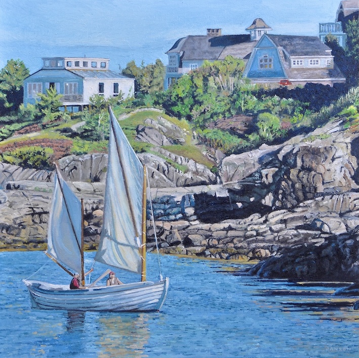
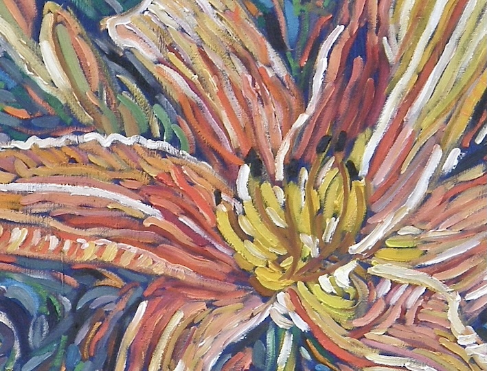
Today’s painting: Back in the days before Canadians became the “nasty” neighbours to the north, we used to travel regularly to Maine, often en route to New Brunswick. One of the regular stops was Ogunquit, where the wealth was clearly on display in the massive summer homes we saw overlooking the coast. At the time I was in one of my “I need to loosen up” panics and made a painting that in the end was a little disappointing in retrospect. I think I focused too much on the paint strokes and not enough on careful observation, which is usually my forte. Unfortunately, I varnished this work and as such, reworking it would difficult to do in order to address some of its shortcomings. I also painted a smaller draft of this beforehand, a little unusual when it comes to my landscapes. I’m usually a one and done guy. A third try? Going back to Maine is out of the question now, not wanting to support a US economy at a time when its President has set his sights on attacking ours. It doesn’t look likely there will be a third iteration. That’s okay.
—
Go ahead and subscribe. It’s free. You’ll never miss another post.